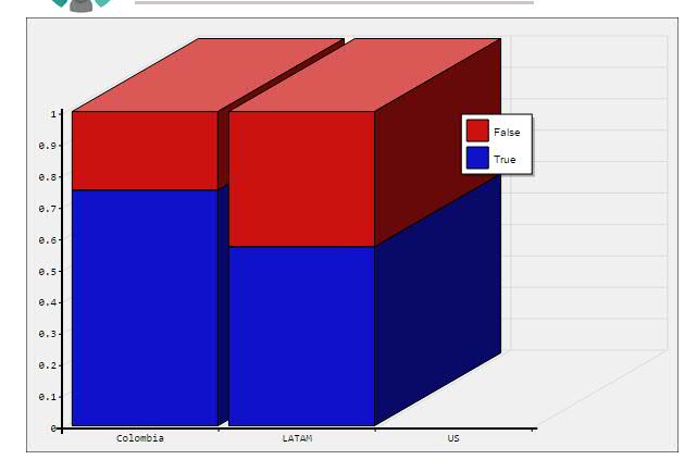
I have created a Stacked Bar Graph (in 3D) using the Forena reports module, which looks like so:
I was able to successfully create this graph. But I am having problems in showing the corresponding values on the bars. The values I want to show on the graph are:
- colombia_blue:0.75
- colombia_red:0.25
- LATAM_blue:0.57
- LATAM_red:0.43
I searched for the frx attributes. I found attributes to change the color of these 2 graphs, but not the label.
Here is the relevant part of my report specification (frx file):


