2

Drupal 7.50, Webform 4.12, Webform Chart 2.0, Views 3.13, Charts 2.0, with Google Charts as the charting engine, so not Highcharts.

I have a webform that collects simple drop down list values for each question. The values are 1, 2, 3, 4 and 5. There are around 10 questions.

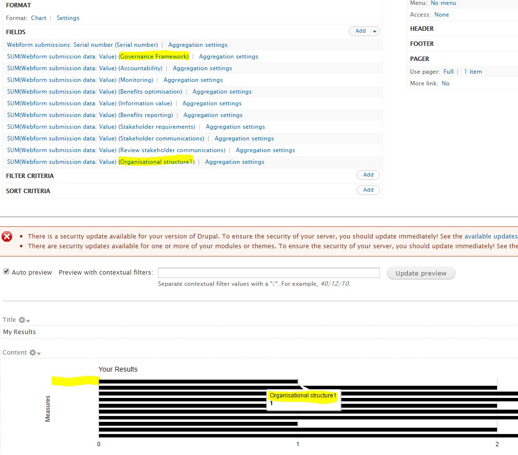
The labels for each component are not displayed on the chart. It seems the Label of the very last field added to the list is used for all fields, and they are only shown when the bar is hovered over.

I created a view and added the webform submission data fields then enabled aggregation and set the format to Chart. Limited the number of records in the pager settings to 1 (So we get just one Webform instance). Example below shows how the first series is called "Governance Framework" but when hovered over, the bar shows the last label "Organisational Structure1".

View configuration and preview

Can anyone advise how I can get the Webform Component Field labels to show up on the left of each of the bars, or fix the hover over issue? Many thanks!

P.s. not sure which module page I should log an issue, so any pointers on how to patch the relevant project would be appreciated.

1
  • Looking at drupal.org/node/2261419 seems like it was fixed, but not for tooltips. So Ideally I would like to show just the correct labels rather than as tooltips (neither works atm).
    – Darren
    Commented Jul 14, 2016 at 14:07

1 Answer 1

0

Module involved

About your PS:

... not sure which module page I should log an issue, so any pointers on how to patch the relevant project would be appreciated.

No doubt possible: Charts.

Using tooltips

It sounds to me that you should have a look at Pass library-specific options via existing #raw_options, which already provides a solution (using #raw_options) to what you're trying to get to work (ie: "tooltips"). For charting engine Highcharts it's already supported (and committed to the most recent dev version, which is the version I recommend), while for charting engine Google Charts (which you are using) you'd need to apply the RTBC-patch attached to comment nr 9. Obviously, after that patch is committed, using the #raw_options will continue to work (for either charting engine). And rest assured, this patch will (not might ...) make it.

With this #raw_options solution, Charts has a solution for using options that are specific for either of the supported charting engines (Google Charts or Highcharts). While still not deviating from a key design concept of the Charts module, which is that all supported charting options should work for either charting engines (you should be able to easily swap from one to the other charting engine, without your charts being affected).

Notes:

  1. Apart from Webform Chart (without s), there is also Webform Charts (with s). The results you'd get are probably going to be similar, because both modules use Charts.
  2. Drupal 7.50, which you are using, is the most recent Drupal version, but still your screenprint includes that (red) error msg with "There is a security update available for your version of Drupal"... bizarre ...

Disclosure: I'm a co-maintainer of the Charts module.

6
  • Hi Pierre, I have applied the patch from #9 on the issue, to the 7.x-2.0-rc1+5-dev version of Charts. I then set the Chart Settings to show labels and tooltips, but this hasn't changed the behaviour at all. It still shows the last Field's label and colour for all bars. Is there something more I need to do with the configuration of the View? Thx for your help!
    – Darren
    Commented Jul 14, 2016 at 14:06
  • Oh, and you're right - I was on the previous release on my local dev machine..
    – Darren
    Commented Jul 14, 2016 at 14:08
  • Well, with that upgrade you at least got those Views UI options about labels and tooltips. And since that doesn't seem to solve your question, I did some extra digesting of your question ... A completely different way to try to get this to work (to put those charts together), is to work with what's called "parent charts" and "child charts", as explained within Steps to create charts using the views UI. More specifically what's detailed within the paragraph "Creating Multiple Series and Combo Charts in the UI". Should I post another answers about that? Commented Jul 14, 2016 at 15:52
  • Sorry Pierre, but I do not wish to create a complex chart with an overlay of another series. I just want each Field to be a bar, with it's relevant colour and key label (As it's configured to do). Is it due to Webform components being used as the Fields, rather than normal Entity Fields? The bars are also all the same colour as the last Field in the list.
    – Darren
    Commented Jul 15, 2016 at 15:30
  • Not sure how to proceed on this (how to best answer you). Maybe you should consider trying the Webform ChartS (with "s" ...) as an alternative? Especially because of what it says on its project page: '... integrates with the "Analysis" tab of a Webform to provide charts for each individual component's analytical data'? Commented Jul 15, 2016 at 15:48

Your Answer

By clicking “Post Your Answer”, you agree to our terms of service and acknowledge you have read our privacy policy.

Not the answer you're looking for? Browse other questions tagged or ask your own question.