0

I've read the book 'responsive web design' by Ethan Marcotte over the week & gone through the documentation on Adaptive Theme website, however, I'm confused about how to take responsive theming forward in Adaptive Theme when I have multiple web pages with their own CSS files.

From the documentation on Adaptive Theming, we have to split the CSS for each layout into its individual file (responsive.smartphone.landscape.css; responsive.desktop.css). Does that mean, we would have the full site CSS in one file for responsive.desktop.css? (! surely thats not right).

The way we have done thus far (in its current form, website is not responsive) is that there are small CSS files for each different regions/ areas of the page. In addition to this, we have custom modules with their own CSS files. How would we go about taking this mass of CSS files & distributing the code into responsive files in Adaptive Theme?

3 Answers 3

1

Few days ago we(team) finished responsive-design site, what we done is simply write your desctop css in your css files like(blocks.css, field.css, node.css, etc..) and for ipad/smartphone version we used another css styles for portait and landscape versions like this:

ipad-landscape.css
ipad-portrait.css
ipad.css
smartphone-landscape.css
smartphone-portaint.css
smartphone.css

And int html.tpl.php

<!--[if !IE]>-->
  <link media="only screen and (max-width : 480px)"  href="/sites/all/themes/acro/css/layouts/responsive/smartphone.css" rel="stylesheet" type="text/css">
  <link media="only screen and (min-width : 321px) and (max-width : 480px)"  href="/sites/all/themes/acro/css/layouts/responsive/smartphone-landscape.css" rel="stylesheet" type="text/css">
  <link media="only screen and (max-width : 320px)"  href="/sites/all/themes/acro/css/layouts/responsive/smartphone-portrait.css" rel="stylesheet" type="text/css">

  <link media="only screen and (min-width : 481px) and (max-width : 1024px)" href="/sites/all/themes/acro/css/layouts/responsive/ipad.css" rel="stylesheet" type="text/css">
  <link media="all and (min-width: 769px) and (max-width: 1024px), all and (min-device-width:768px) and (max-device-width:1024px) and (orientation:landscape)" href="/sites/all/themes/acro/css/layouts/responsive/ipad-landscape.css" rel="stylesheet" type="text/css">
  <link media="all and (min-width: 481px) and (max-width: 768px), all and (min-width: 481px) and (max-width: 768px) and (orientation: portrait)" href="/sites/all/themes/acro/css/layouts/responsive/ipad-portrait.css" rel="stylesheet" type="text/css">
  <!--<![endif]-->

for specific pages we wrote css in this files.

Update Also we use sass and compass for css styles.

6
  • This is excellent, thanks Neok. I'll look into this.
    – Kayote
    Commented Dec 10, 2012 at 9:30
  • One point though, you are making the changes in the core HTML.tpl.php which I wonder whether is a wise move...
    – Kayote
    Commented Dec 10, 2012 at 9:37
  • We change our HTML.tpl.php in our theme folder /templates files, i dont see anything wrong with it.. Commented Dec 10, 2012 at 10:06
  • Yes, you are right. However, what did you guys do for the multiple pages. Did you add the different page css for ipad-landscape.css in that one file alone?
    – Kayote
    Commented Dec 10, 2012 at 10:22
  • 1
    all in one file(for example ipad-landscape = we write all css for all pages there: .node-article{} etc), no point to separate, only if you have a lot of content types and a lot of different pages i guess Commented Dec 10, 2012 at 10:33
2

The more recent methods concerning responsive design is "mobile first". It's more time consuming to theme a desktop site and then bring it down it pieces to a mobile version, but some of this goes into the initial architecting as well. But, this is another topic.

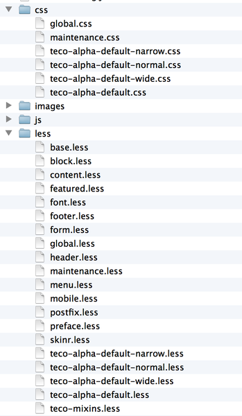
You should keep your CSS as generic as possible at first, then drill down to specific items when you need to. Something you might want to look into is using a CSS preprocessor like LESS or SASS. On our projects (generally using LESS), we make CSS files for different regions of the site. Header, content, sidebar, footer, mobile, etc. and then compile them all into a few CSS files. In this screenshot, you can see the different sections broken up and they're all compiled into the global.css (the others are direct).

enter image description here

1
  • I am using Less with Emmet docs.emmet.io (emmet makes a few of Less's functionality redundant with its own implementation & its awesome). I love how you guys have so neatly set everything up. I haphazardly went about amending the Sky (Adaptive Sub-theme) & now its all such a big mess. Within the next quarter, I need to go back & redo it all as you guys have done. Wonderful answer & very helpful.
    – Kayote
    Commented Dec 10, 2012 at 9:33
0

I use these css-files (e.g. responsive.smartphone.css) for the device-specific styles only, everything that applies for all devices goes into a "basics.css" or however you want to name it. The module-specific css stays where it belongs and in the css-file for a device-size are only the overrides of that...

I often work along the "desktop first" line and add the styles for the smaller devices afterwards. And if you have a complex layout, then the specific stylesheet can grow accordingly.

2
  • Does that mean that if your site was say 5-10 pages, all the changes for 'responsive.smartphone.css' would go into this one file? That doesn't sound right to me. I wonder, if we can add the media queries to each custom CSS file, thereby, having one file for one page with different media queries for different devices... after all, thats suppose to be the recommended way of writing responsive CSS.
    – Kayote
    Commented Dec 10, 2012 at 7:25
  • This is also possible, but personally i think it's harder to keep it maintained this way.
    – Volker
    Commented Dec 10, 2012 at 7:36

Your Answer

By clicking “Post Your Answer”, you agree to our terms of service and acknowledge you have read our privacy policy.

Not the answer you're looking for? Browse other questions tagged or ask your own question.