0

I need to apply dynamic css for each node. I have stored the css into the database for each row of the page.

I have generating css like node_57002-en.css here, 57002 is a node-id with language code for each responsive layout. For eg. If I select width for desktop layout for node-id-57002 then node_57002-en.css generated with below code.

@media only screen and (max-width:991px) {}@media only screen and (max-width:767px){}

I have to find out the better solution becouse, everytime generated the new css for each node. Below is the code which I used,

$styles = $nodeProcessor->getStyles();
$rowCss = $styles->getDesktop() . "@media only screen and (max-width:991px) {" . $styles->getTablet() . "}" . "@media only screen and (max-width:767px) {" . $styles->getMobile() . "}";
$cssPath = $modulePath . '/resources/css/rows/node_' . $this->_nid . '-' . $this->_langCode . ".css";
$cssPath .= '?' . filemtime($cssPath);

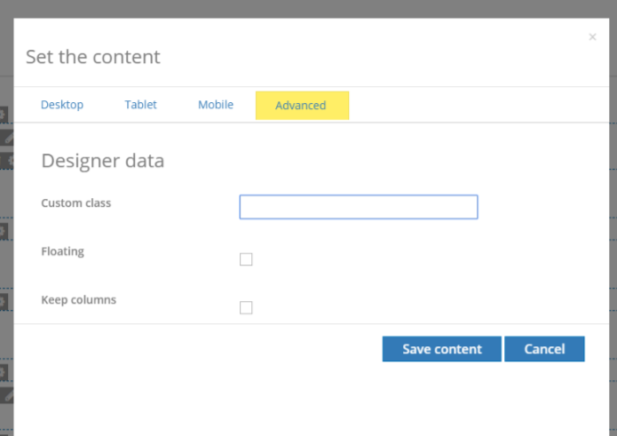
enter image description here

I have some questions on this,

  1. How to get that css from db and how to apply on front-page in drupal manner.

  2. How to cache the library css and how to clear the cache when css updated?

  3. If not then what is the alternative option.

I referred Dynamically generated CSS and JS document but it is only for dynamic js. I really appreciate if anybody helps me. Thanks in advance.

3
  • Is the CSS for different each node? If yes, how different is it? Maybe show an example of the css? The way I do it is: create a function in the .theme file to generate a variable to use in the twig template, then add a style tag in node.html.twig and let the variable do the work based on the node. Maybe it wont work for your case, but I will need to see the CSS differences for the nodes and what needs to be generated. Commented Nov 3, 2017 at 12:26
  • This seems way over engineered to me. Why not use something like Panels or Display Suite to dictate layout per node? Responsive should work without needing to set CSS per device per node, contained all within the CSS itself. Why would breakpoints change from one page to the next in regards to mobile or tablet?
    – Kevin
    Commented Nov 3, 2017 at 13:58
  • I'm pretty sure what you're trying to achieve can be done by generating necessary classes and related CSS. Commented Nov 3, 2017 at 19:23

1 Answer 1

1

I think you're over-engineering things here.

If your CSS is per-node-specific and stored in the DB anyways, then why not just use a text field to store the CSS? You just need to create a field template to output the raw content of the field in a <style scoped> tag.

6
  • 1
    Agree, something really bad is happening here then.
    – ssibal
    Commented Nov 3, 2017 at 12:43
  • Updated my question. I hope this makes sense.
    – latikas
    Commented Nov 3, 2017 at 13:11
  • Seeing your screenshot I would advice not to use any dynamic/inline CSS at all. The only thing you need is dynamic CSS class injection (can be done either in template preprocess or twig) and the same CSS for all nodes.
    – Hudri
    Commented Nov 3, 2017 at 14:46
  • Can you please help me to understand with an example how should I do this in template preprocess? Currently, I am included in twig file like {% if cssFile is not empty %} <style media="all"> @import url("{{cssFile}}"); </style> {% endif %}
    – latikas
    Commented Nov 6, 2017 at 7:18
  • The content type row has 3 css fields for desktop, tablet and mobile. These fields need to be compiled and added to the css. As Drupal requires css files to be added to libraries at installation / cache rebuilding, we have to add the css using a script tag in the block template. In _block_module.html.twig template, I have imported this css. Is any way to add the css of rows without rendering it in the block template??
    – latikas
    Commented Nov 6, 2017 at 9:19

Your Answer

By clicking “Post Your Answer”, you agree to our terms of service and acknowledge you have read our privacy policy.

Not the answer you're looking for? Browse other questions tagged or ask your own question.