2

We're using a theme based off Adaptive Theme, but even dropping columns below the main content still has undesired rendering outcome. When region-sidebar-first drops below content-inner there is a problem -- since the link colors contained within sidebar first and the body background color are both white.

enter image description here

What I'd like to have happen is that for mobile devices or when the browser size is under a certain width, I'd like to remove region-sidebar-first and region-sidebar-second and move the menu into another field that into another collapisable region to function as a 'mobile menu'.

Question: Could context handle this? Is there a mobile to handle such logic?

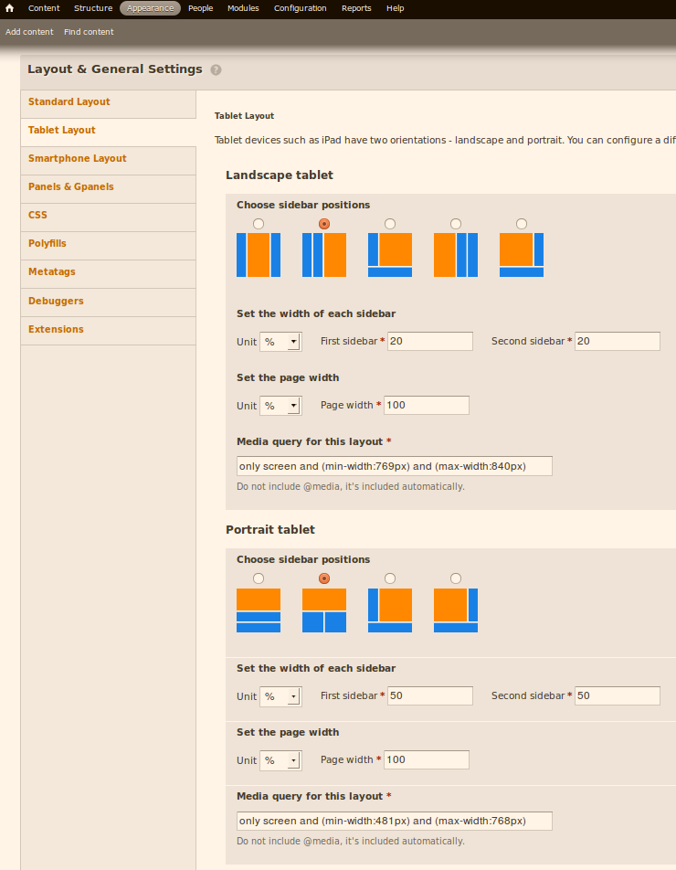
Current our setting appear as follows enter image description here
2
  • 1
    You'll struggle to make such a workflow responsive in the true definition of the word. Context can make decisions by browser sniffing, but the idea of responsive theming is that you design for mobile first, and that the server-side doesn't get involved. As such, if you need something on >=narrow layouts that you specifically don't want in the mobile theme, the answer is to hide it with CSS.
    – Clive
    Commented Feb 5, 2013 at 17:14
  • Yes, I'd much rather approach rules based on width than on the device.
    – Rick
    Commented Feb 5, 2013 at 17:33

1 Answer 1

2

This is more a CSS question I think. I solved this problem already for various sites using another menu block, with its own css markup, or using a jump menu.

Using media queries you will have to set the threshold on where to break:

@media all and (max-width: 370px) {
    .default-menu-region {
        display:none;
    }
    .mobile-menu {
        display:block;
    }
}

@media all and (min-width: 371px) {
    .mobile-menu {
        display:none;
    }
}

Adaptive theme provides files for those media queries already, you can just drop your custom content in there instead of writing new media queries like in this example.

1
  • Well this would certainly settle the short range problem of white link and background color. Thank you also for a very clear example of how to build the CSS media rules.
    – Rick
    Commented Feb 5, 2013 at 17:32

Your Answer

By clicking “Post Your Answer”, you agree to our terms of service and acknowledge you have read our privacy policy.

Not the answer you're looking for? Browse other questions tagged or ask your own question.