7

I've been searching for a solution to my problem for a while without success so maybe someone here can help me.

I've already looked at the answer to the question about "How to combine 3 line charts in a single chart, using the Views integration of the Charts module?", but that didn't help to solve my issue.

I use the Charts module to create a chart in Views using the "Chart" display format. And I'm using Highcharts as my charting library to draw the number of "Passed" nodes (in green). I also created a chart add-on to represent the number of "Failed" nodes (in red) so that I can have multiple series in the same chart.

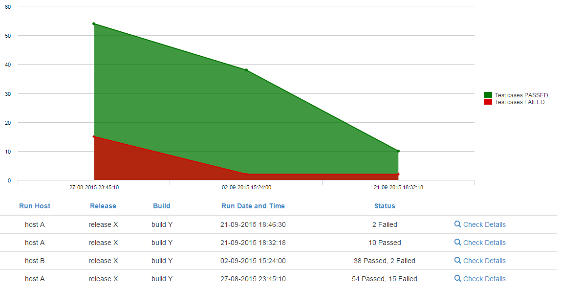
At this moment this is the chart that I have with the problem I will describe below:

enter image description here

As you can see in the table above, I have 4 different dates (Run Date and Time). The chart should show the 4 dates. Instead, it only shows 3 dates and this is why: The last date doesn't have "Passed" nodes, so the chart display (the parent) does not have that value on its axis. The chart add-on, representing the 2 Faileds on the last date, is then represented on top of the first display using the 3rd date and not the 4th, giving the error.

It seems that the x-axis values are irrelevant in this module.

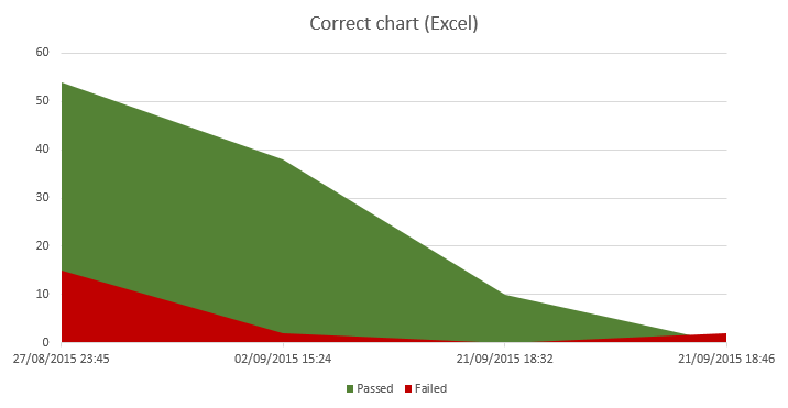
The chart that I want should be something like this:

enter image description here

I made this chart in Excel and the difference that I see (that is giving me the wrong results in Drupal) is that I don't have a "0 Passed" or "0 Failed" but instead I have no results at all.

Is there a way to get this working correctly? I tried already many charts modules available and everyone has this problem as far as I know ...

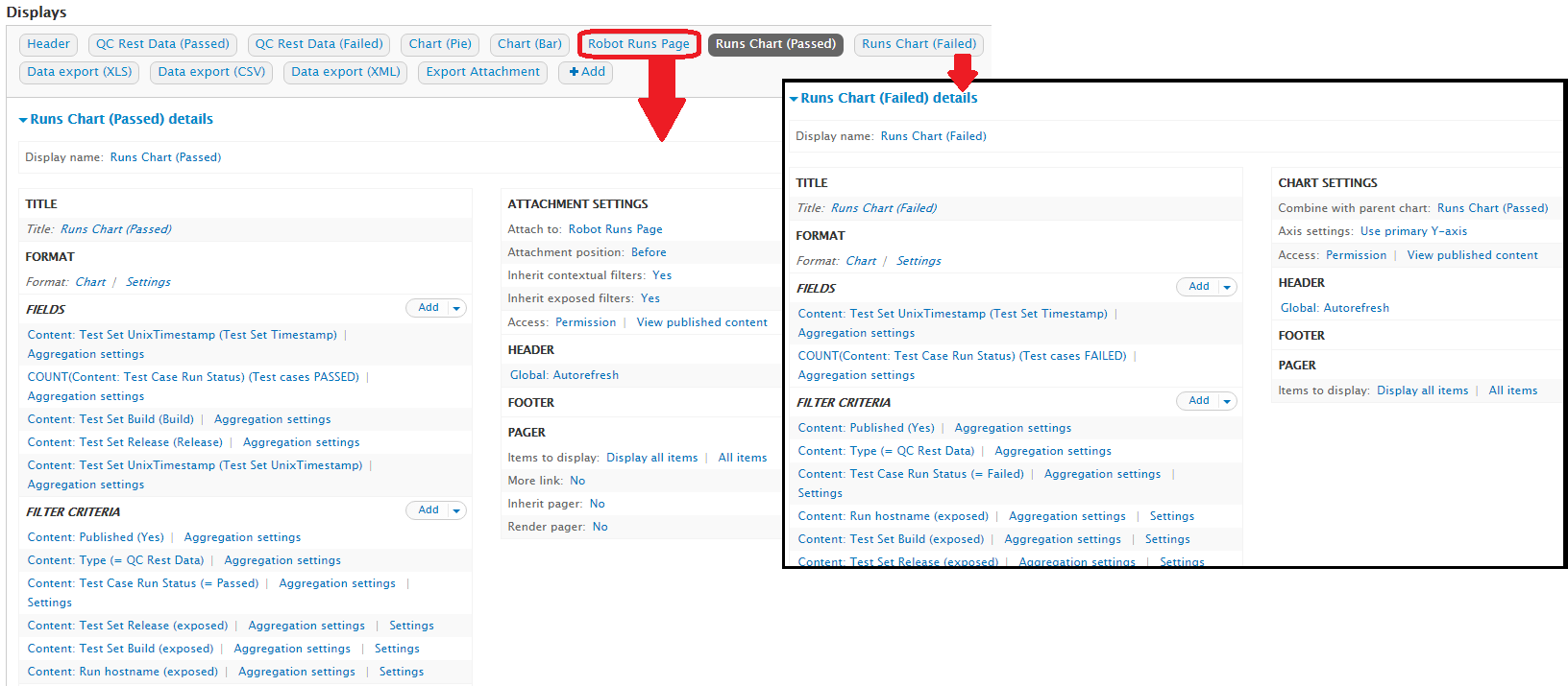
Below is also a screenprint of my view:

enter image description here

Note: for the table below the chart I'm using module Views Merge Rows and it's clear that the top two dates don't show the "0 Failed" or "0 Passed" (as shown in the tabular display of my first screenprint) needed to have a correct chart displayed.

EDIT: I have found the same issue here and here. Hope it helps.

If there's need to have a solution like in the second link, i.e., construct the view in a way that both series will always have all labels, I'm open to it.

2 Answers 2

1
+50

Step 1

Not sure if it's your "only" problem to get your chart right, but part of your problem is, pretty sure, that you have "holes" in your data, similar to what is detailed in Comment nr 12 of Issue nr 2052429.

About the problem

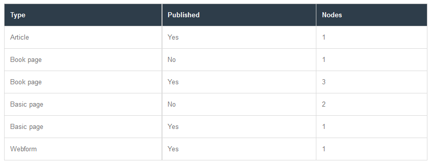
To understand what that issue about "hole" is all about, consider these data to be charted:

enter image description here

Note that for the Types Article and for Webform, there is no row with Published = No (that is, there are no unpublished nodes for these types). So in this scenario we have 2 so called "holes" ... And that's were the trouble start:

  • Problem 1: a column chart for these data looks like so:

    enter image description here

    The bar for "Article" (with value 1) is wrong, that bar is actually related to the value 1 for unpublished "Book pages". And the bar for "Book page" (with value 2) should actually be the bar for the 2 unpublished "Basic pages".

  • Problem 2: a line chart for these data looks like so:

    enter image description here

    In this case, the line for "unpublished" suffers similar problems. So it doesn't matter what type of chart you're creating, all charts have this issue.

How to solve this problem

Upgrade to the most recent Dev version to start with (which is much better / stable then the current rc1 version). Then apply the patch attached to the issue comment mentioned above, and check if that helps in your case. If it doesn't, know that it is a prereq for sure (without that patch you won't be able to get it to work). Attention: the patch doesn't seem to apply anymore to the most recent dev version. To make it work (again), do not use the above mentioned patch, but instead use the re-rolled patch attached to in Comment nr 31 of Issue nr 2052429.

Here is how the same column chart from above looks like after applying this correction:

enter image description here

And this is its corresponding line chart:

enter image description here

... Which I believe is the chart that exactly matches the tabular data shown above.

Step 2

If upgrading to the most recent dev version and applying the patch is not sufficient, then I'd recommend you to (temporarily) disable that Views Merge Rows module you have enabled. And (temporarily) modify your view to show the values for PASSED and FAILED as 2 separated columns. And then verify if you get the correct results. That way we can verify if this Views Merge Rows module is the culprit (solve support requests is like taking away all possible causes, 1 at a time ...).

Step 3

If step 2 doesn't help either, then I recommend what's written in the "Bonus tip" of Steps to create charts using the views UI, i.e.:

You may find it easier to start with a "Table" display and convert it to a chart display after setting up the data. It can be easier to visualize what the result of the chart will be if it's been laid out in a table first.

In other words: before trying to create a chart, make sure the tabular version of it has the correct data displayed.

Step 4

If none of the previous steps helps, then you may want to check the result you get by correcting your view like so:

  • Create another display in the same view, let's say you name it "Runs Chart (Total)". It should be equal to all the specs of "Runs Chart (Passed)", but without the filter "Content: Test Case Run Status (Passed)". Obviously, it'll reflect the total Runs (both passed and failed). I'd make it a "line chart" (but that's a matter of personal preferences).
  • Adapt the "Chart settings" of "Runs Chart (Passed)" to have it use "Runs Chart (Total)" as the parent chart.
  • Adapt the "Chart settings" of "Runs Chart (Failed)" to have it use  "Runs Chart (Total)" as the parent chart (instead of "Runs Chart (Passed)").

Step 5

If the work around in step 4 helps as a work around, you may want to further refine the chart settings of "Runs Chart (Total)", by using a color for the line chart that matches the background of your chart (like white?). Possibly something similar for any of it settings like "Legend" (like set it to  ?

Disclosure: I'm a co-maintainer of the Charts module (+ author of its community documentation),
I hope this does not violate the site's policy on self-promotion.

7
  • Hi Pierre, I already tried those 3 steps. The issue, as I said before is how the module is implemented. The x-axis is always dependent on the number of labels of the parent chart.
    – zephirus
    Commented Nov 1, 2015 at 11:34
  • i just added "Step 4" ... curious if that may help to get it working in your case ... Let me know, ok? Commented Nov 3, 2015 at 7:34
  • Hi Pierre, Step 4 is a good workaround but it still doesn't solve it all. With this step I don't have "holes" in the data because the parent chart has every x-axis label. But it comes with a price: I have a line that I don't want to show and a legend. Instead of counting the status field I can Sum it and the line doesn't show but still, the legend is there. Conclusion: it's a good workaround, not a solution. Thanks for your support.
    – zephirus
    Commented Nov 4, 2015 at 0:20
  • Great news about Step 4! I just did 1 more attempt to have you consider my answer as (more or less) acceptable ... Maybe it also helps to not have your bounty go to the "Drupal.SE waste bin" in a few hours from now? Commented Nov 4, 2015 at 8:18
  • Hi again Pierre. About Step 5. Changing the line color is not a solution. The chart heigh adapts to show the line (even if we don't see it) and if we have data labels, they will show. My comment about the workaround is in fact the best solution till now. A final solution for this has to be done by changing the module code, there's no other way. One of the things that should be possible in the future is to have settings for both the parent and the add-on charts. I will accept your solution with the 5 steps anyway as it is the best at the moment.
    – zephirus
    Commented Nov 4, 2015 at 14:28
0

I believe that what you need to do is construct the view in a way that both series will always have all labels.

To do this, all you need to do is make sure the "Count the number 0 as empty" field is unchecked. To find this field, click on the field name that you're counting to bring up its config overlay. Select "No Results Behavior" and make sure that the "Count the number 0 as empty" checkbox is unchecked. "Hide if empty" should also be unchecked.

Does that fix your problem? If not, it would be helpful if you exported your view and posted it, or at least the section regarding the field you're counting on.

4
  • Hi Erin, that doesn't solve the problem. Imagine you have 3 nodes like this (x, y): [a, 1] [a, 2] [c, 3]. If you create a chart in views, the "b" label will never show, no matter what. The solution has to be made in charts. If you have the first display of type chart where there is labels a, b, d. Then, if you create a second display of type chart add-on and the data has only labels a, c, d, the final chart will have only 3 labels, defined in the first display. There is a workaround for this problem but implies that you create aditional fields in the db.
    – zephirus
    Commented Oct 28, 2015 at 15:24
  • Oh dang, I totally misunderstood the question. Sorry! Commented Oct 28, 2015 at 15:35
  • Here is also a good explanation of this issue. Sadly, no solution till now :(
    – zephirus
    Commented Oct 28, 2015 at 15:43
  • Unfortunately, it looks like something that's going to need a patch to the module to fix. Commented Oct 28, 2015 at 16:24

Your Answer

By clicking “Post Your Answer”, you agree to our terms of service and acknowledge you have read our privacy policy.

Not the answer you're looking for? Browse other questions tagged or ask your own question.