0

I have successfully created a grouped bar chart using the Forena module. My application supports English, Portugese and Spanish.

But I am not able to translate my chart to Spanish and Portugese. I need to translate the chart title, labels on each axis and the legend.

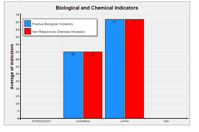
Here is the chart I created so far:

enter image description here

I wonder how I can translate the following strings in this chart:

  1. Biological and chemical indicators
  2. Average of indicators
  3. Positive biological indicators
  4. non responsive chemical indicators

1 Answer 1

1

Here are the steps to create a translated version of a chart (or more general: a report) using the Forena module:

  • Make sure (core) module locale is enabled.
  • Instead of using the "edit" icon to change the specs of a report, use the "translate" button next to edit. Then select the language to which you want the report (chart) to be translated.
  • On the next screen, enter the translated report (chart) title.
  • You should get some informational message as in this example (in which I created a 'nl' version of drupaladmin/active_users, for which I changed the tite from "Active users" to "Actieve Gebruikers"):

    Translation, Actieve Gebruikers has been created. Switch languages to translate.

    Your report, nl/drupaladmin/active_users has been saved.

  • After switching your active language to the language for which you want to create a translated version, you'll be able to change anything of the report (charts) specs to the specs of your additional language.

  • In your case here, you can now modify those 4 strings

Bottomline: tranlating Forena reports is similar to translating nodes.

2
  • Can you EDIT your question to better explain what you mean with "stuck on the 5th step"? After you do, I'd be happy to try to further enhance my answer about that too, OK? Commented Oct 15, 2015 at 8:57
  • Great to hear so (+ thank you for accept / +1). I'm curious what the missing piece was to get it to work (just to learn from it myself). By the way, looking at your chart in the question, have you tried/considered to make it a 3D variation? Or a cylindergraph? A matter of personal preferences of course, but I usually use these variations of charts. Commented Oct 15, 2015 at 9:04

Your Answer

By clicking “Post Your Answer”, you agree to our terms of service and acknowledge you have read our privacy policy.

Not the answer you're looking for? Browse other questions tagged or ask your own question.