How do I have a fixed width left column and fluid right? At the moment, in my panels config there is only the fluid layouts available e.g. AT Two column 33/66.
1 Answer
From the AdaptiveTheme documentation:
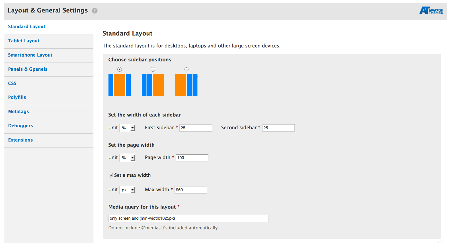
Sidebar Units and Widths You can use any combination of units - meaning you can set a percentage width on the page and pixel widths on the sidebars. In some layouts you can only set the width on one sidebar because the second sidebar wraps below the main content and becomes a full width horizontal region - useful in smaller screen displays.
Example screenshot:

If you're using Panels, however, you're going to have to modify the CSS/theme code yourself. You can either make your own new layout (just look at the code-- AT is pretty well documented) or just override the part that is making the layout fluid. Note that doing this is almost certainly going to break the "responsiveness" of AT.

pxas the size attribute